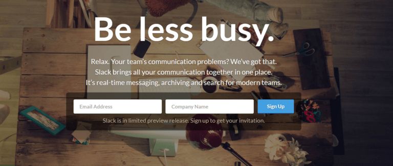
When Slack first launched in 2013, its homepage brand messaging said:
It sounded great; until it didn’t.
The line was too vague. No one was searching “how to be less busy at work” on Google. They were most likely searching “how to stop endless email threads at work” or “Best app for team messaging,” the pain points Slack’s early demos targeted.
That’s a real problem most team leads or companies at large face.
Messages like that won’t convert because it’s speaking in concepts, not pain.
When people search for solutions on Google, they hardly care about the concept. There’s a burning problem that needs to be solved.
You wonder why your “clear” copy doesn’t resonate.
The truth is that people don’t act on clever slogans; they act when you describe frustrations like email chaos better than they can.
It’s no fluke. It’s psychology.
And once you understand how emotion drives decisions, your brand messaging stops sounding good and starts working.
Let’s get into it.
People don’t buy what makes sense. They buy what feels safe.
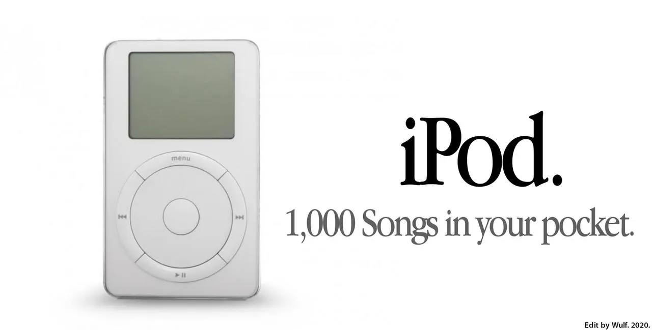
When Apple released the first-ever iPod, they didn’t try to sell it by saying, “1GB MP3 player” because they understood consumers do not care about those cold, technical facts.
Except you are trying to sell only to techies.
Instead, they said:
Concrete imagery beats technical facts when the goal is conversion, not documentation.
Just as advertising researchers van Horen, Wänke, and Mussweiler put it in their 2023 study:
“…for advertising in retailing and during a sports event, showing that concrete, rather than abstract, communication is especially persuasive when people experience uncertainty”
No emotion = no action.
So when your landing page says, “We provide innovative digital solutions for modern businesses,” it’s logical, but emotionless.
And emotionless doesn’t convert.
To fix this, you have to translate your feature into a feeling:
Instead of “advanced analytics,” say “know what’s working before your boss asks.”
Instead of “AI-driven scheduling,” say “never miss a client call again.”
It’s been proven time and again that people buy peace of mind, not feature sets.
2. The biggest conversion killer: you’re solving the wrong problem.
Here’s what a lot of brands get wrong: most messaging fails not because it’s bad writing, but because it’s written for the wrong pain.
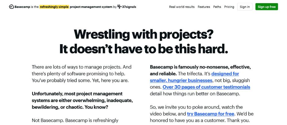
For years, project management software shouted about collaboration features.
Basecamp did something different. They built their message around overwhelm because that’s what their target audience wants to be addressed.
Here’s a quote from one of their customers that corroborates this sentiment:
“Stressful, impossible, difficult, overwhelming. It was honestly a hot mess. I would lose track of deadlines left and right and they would creep up on me at the last minute. My boss would ask me a question about a past project and I would struggle to hunt down my notes regarding it (because they were all in email). As hard as we tried to stay organized we had a hard time managing our projects and work flow. When dealing with design projects for over 90 practice sites it was like getting lost in a giant corn maze.”
Jennifer Hawks, ProHealth Physicians
This is a real problem their product caters to.
And
That line speaks directly to how work feels before using their product.
That’s what behavioural psychologists call “problem alignment“: starting where your customer actually is, not where you want them to be.
HubSpot’s conversion optimisation research tells us that conversion only improves a lot when brand messaging is aligned with user pain points.
This is not because of clever design, but because relevance makes users feel understood and prompts them to take action.
Brainstorm less and listen more.
Here’s what to do:
Use original phrasing and lines from support chats and sales calls.
Use exact phrases or words from search intent.
Make your copy sound like something they would say out loud.
3. Familiar beats clever every time.
Clever copy wins awards. Simple copy converts.
Behavioural scientists call this “cognitive fluency“. It means the easier something is to process, the more we trust it.
Here are proofs that simple words convert better. When brands swapped clever for clear and practical:
Case
Reworded the CTA text just above the form. Specifically, replaced “Skin consultation” (generic) with “Expert opinion,” which more clearly conveyed the benefit. (static.wingify.com)
Result
What this supports
Kaya (via VWO)
Reworded the CTA text just above the form. Specifically, replaced “Skin consultation” (generic) with “Expert opinion,” which more clearly conveyed benefit. (static.wingify.com)
137.5% increase in conversion rate (from ~4% to ~9.5%) just from the CTA wording change. (static.wingify.com)
Demonstrates that making the CTA more specific/benefit-focused and reducing vagueness can have large impact.
FROGED / Marketingsherpa Example
Changed CTA from “Learn More” to “View pricing” on a software product page. The old CTA didn’t clearly tell users what to expect. (MarketingSherpa)
Increased CTR from 2% to 5%, and increased conversion to paying customers by ~20%. (MarketingSherpa)
Direct illustration: clarity (tell people what they’ll get) beats generic actions (“learn more”).
GoCardless
Tested “Request a demo” vs “Watch a demo.” The word “Request” implies delay/effort, “Watch” suggests instant value. (HubSpot Blog)
“Watch a demo” version had 139% more conversions than “Request a demo.” (HubSpot Blog)
Words matter: small shifts in how “action” is phrased change perception of effort, friction, immediacy.
Lucidpress
Originally used “Sign up free” across their CTAs. They changed to CTAs specific to the visitor’s page content: “Design a [keyword from page].” So instead of generic “sign up”, they tailored to what the page visitor was motivated by. (MarketingSherpa)
Got ~5% increase in registrations and ~6% increase in engagement metrics after the change. (MarketingSherpa)
Tailoring CTA copy to visitor intent or context—making it clear what the user will do—boosts effectiveness.
Consolidated Label (via VWO)
Added prominent CTA button “Instant Online Quote” in a product page where control version had no CTA button. So from no immediate “get-quote” option to “Instant Online Quote.” (static.wingify.com)
Emphasizes clarity (+ immediate, benefit-oriented action) rather than fancy wording or delaying action.
Here’s what to do:
Do away with buzzwords. If you need an acronym or jargon, you’ve already lost.
Use short verbs: get, start, see, learn, build.
Read your headline out loud. If it sounds like something an actual human would say, you’re close.
This is a reminder that your clever line might make you or your creative director smile. But your customer just wants to understand you quickly.
What do these three lessons on brand messaging have in common?
None of this is about tricks. It’s about empathy, clarity and timing; the same fundamentals good marketers have used for decades.
Emotion drives action.
Relevance builds trust.
Simplicity closes.
Before you redesign your site again, test your message against those three filters. If it doesn’t make someone feel something, recognise their pain and explain your value in plain English, that’s your real conversion problem.
How to Fix Brand Messaging That Doesn’t Convert (A 4-Step Framework)
Most teams try to “fix messaging” by adding adjectives or rewriting headlines. That’s like repainting a house with a cracked foundation.
Good messaging starts with behaviour, not brainstorms. Here’s the framework we use — adapted from research by behavioural scientists like BJ Fogg and marketers who measure what actually converts.
Step 1: Research Emotionally, Not Just Demographically
Don’t just ask “Who is my audience?”
Start asking, “What do they feel when they come to this page?”
According to Harvard Business Review, emotionally connected customers are more than twice as valuable as highly satisfied ones. Yet most marketers only know surface-level details: age, income, and job title. Those don’t predict behaviour.
Basecamp, for example, built its copy directly from customer pain emails. When users wrote “stressful, impossible, difficult, overwhelming,” that exact pain became the headline. That’s emotional data in action.
How should you do it?
Talk to at least 5 customers. Ask, “What was happening the day you went looking for this product?”
Write down exactly what they say. Find a common phrase, word, emotion or pain. That’s your copy.
Step 2: Map Copy to Customer-Journey Emotions
Each stage of the journey has a dominant feeling:
Stage
Emotion to Write For
Example
Awareness
Curiosity
“Ever wonder why your ads stop working after three weeks?”
Consideration
Trust
“Used by 30,000 teams who needed fewer meetings.”
Decision
Urgency
“Enroll before seats fill for October’s cohort.”
Step 3: Rewrite Using Psychological Triggers
You only need one trigger per message. Too many, and people freeze. Here are four that work in conversion data:
Trigger
Description
Real Example
Loss Aversion
We fear losing more than we value gaining (Kahneman & Tversky).
“Don’t miss out on your bonus credits” — Amazon Prime sign-ups increased 10% after adding this (source: Baymard Institute UX research).
Social Proof
We copy what others do.
“Join 50,000 creators on Substack.”
Commitment & Consistency
Once we say yes, we prefer to stay consistent.
LinkedIn’s “Add skills” progress bar — users complete profiles 20% more often (source: LinkedIn Data Science blog).
Cognitive Ease
The brain trusts simplicity.
Mailchimp’s “Send better email.” wins on clarity over “omnichannel engagement.”
4: Test & Iterate with Behavioural Feedback
Analytics tells you what happened. Behaviour tells you why.
Tools like Hotjar and Microsoft Clarity record scrolls, clicks and rage-clicks — all signals of friction.
The point is to listen with data. When you see a phrase customers click or repeat in support chats, add it to your permanent messaging. Real-world reactions > internal opinions.
Takeaway:
Your messaging doesn’t convert because it wasn’t built from emotion, journey or feedback. This 4-step loop — Research → Map → Trigger → Test — turns guesswork into an evidence-based system.
Your Brand Messaging Looks Professional. So why Isn’t It Converting?
You don’t have to scrap your whole brand message. But if your words aren’t converting, something’s off, and it’s not your design.
It’s friction. It’s mixed signals. It’s a copy that sounds smart instead of making people act.
That’s what we do. We fix problems like this for brands like yours at Detutu Media.
Book a free messaging audit, and we’ll show you which psychological triggers you’re misusing, where you’re creating friction, and the exact copy changes that fix it.